
Netflix is the world's leading streaming entertainment service with 208 million paid memberships in over 190 countries. With the mission "to entertain the world," Netflix strives to offer customers the best service.
The streaming industry has been rapidly booming over the past few years, and with the impact of the Covid-19, people spend more time at home and stream content much more than ever. Therefore, the industry has become highly competitive with the mushrooming of platforms. To continue reigning supreme in the streaming world, Netflix is finding a way to increase user engagement and retention.
Netflix has realized the lack of social interactions in their app while the demand for social connection is high due to the pandemic. Besides, the competition in the industry is fierce. Therefore, they are thinking of an add-on feature related to the social spectrum seamlessly integrated that can bring user experience to the next level.
I came up with a solution that helps Netflix users connect, stay engaged, and influence each other's decision-making through a seamless recommendation system.
Walkthrough Screens
The new feature walkthrough process was broken down into 3 screens to introduce a new feature to users, and inform the users what's to expect, how they could interact with these new things.
Find & Follow
Recommend & Get Recommendations
Account Privacy Settings
This is how I came up with the solutions, let me walk you through
Market Research
Competitive Analysis
User Interview & Survey
Affinity Map
User Persona
User Journey
Problem Statement
Brainstorming
Feature Roadmap
Sitemap
Task Flow
User flow
Wireflow
High-Fidelity Prototype
Usability Testing
Affinity Map
Final Prototype

I begin the project by conducting research to get more context of the landscape & understand people, their needs, and what their motivations are. Before diving into research, I set out a research plan for where I'm headed including research goals, assumptions, questions, and methodologies. The research finding plays a crucial role in laying a foundation for ideating solutions in a later stage.
Research Goal
To gain a better understanding of the impact of social aspects on people's behavior regarding video streaming. Besides, I would want to understand the market and uncover the influences of friends & family on the decision-making process regarding what content to watch and how they often share entertainment content with their loved ones.
Assumptions
Methodologies
I started with analyzing the market to get a better understand about the streaming industry, how it has been change since the pandemic and what's the current trends.
is the expected market size of the global video streaming by 2027
Source: Forbes

of consumers prefer using their smartphones to enjoy their favorite OTT streaming services.
Source: Ventunotech

of millennials are now subscribed to streaming services to watch original content.
Source: Forbes

increased in online video streaming in the US and Mexico since the outbreak of COVID-19.
Source: Statista
After grasping an idea of the land scape, I moved to analyze competitors to gather insight into their strengths and weakness. These insights also help me identify any gaps in features that Netflix might address and uncover the highlighted features and trends the competitors are implementing.
I listed 2 direct competitors of Netflix that offers the same service which are Hulu and Amazon Prime. I also looked into Youtube as an indirect competitor to analyze how the social spectrum is designing to cater user's need on the app. Please find full competitor analysis here.


Before talking with users, I did additional research by listening opinions from current Netflix's users on Apple store. Some of them have suggest the recommendation features and some leave complains about the irrelevant of Netflix's current algorithmic suggestion.


Next, I conducted primary research with both interview and survey to gain insight into current user frustrations, goals, needs and motivations as well as have an understanding on broader scale when it comes to experience Netflix service and platform.
Interview Objective
1-on-1 User Interviews
Survey

Research Findings
The detail of research finding was documented here

Assumptions Validated
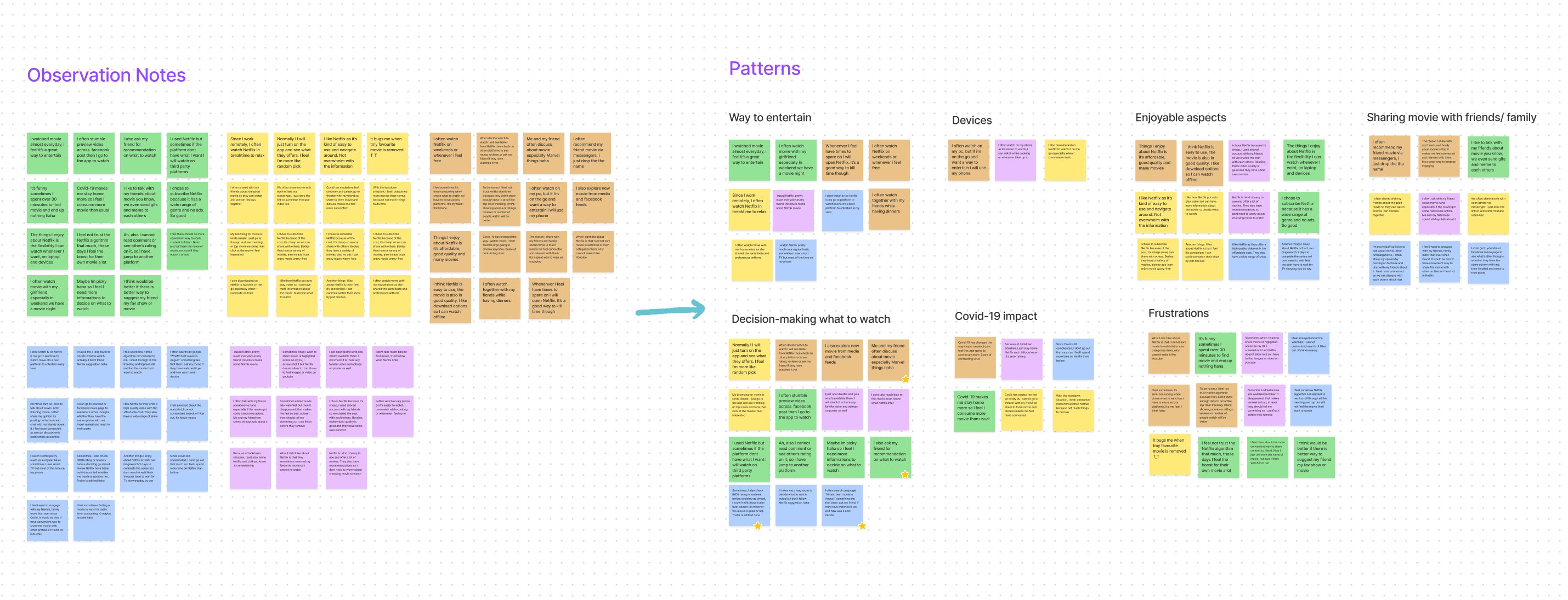
After summarizing the findings from the research, I transcribed the interview scripts, survey notes into observation notes highlighted in capturing how participants think, feel, say, and do. Then I started to find the pattern emerging in the qualitative data and organized them into categories. By doing this, I can uncover common patterns that led to key insights that would help me identify our users’ needs.
You can view more detail at my Research Synthesis board on Figjam.
I was completely surprised as most participants in the survey, and interview session mentioned it took them longer than expected to find what's movie to watch. They are pretty doubtful with Netflix's algorithm.

Discover new content in time-efficient way
To help faster decision-making process and reduce multi-steps when it comes to deciding what to watch as users tend to value their friend's and family recommendations.
4/5 participants mentioned that reviews and ratings, friends' recommendations, social media influences, and favorite movie cast are primary factors when deciding what to watch. They feel seeing suggestions in the app couldn't be enough information on how good or bad the movie/show is.

A seamless way to recommend movie to friends/ family within app
To give more sense of connecting, engaging with each other as they love to share the story with others.
4/5 participants mentioned they often discussed with their friends about the movie and asked for their friend's recommendation because they feel more connected and trust their friend's opinion.

Instill trust among users
To provide more information, make users feel less about the brand's control on the algorithm.
3/5 participants felt they didn't trust Netflix's algorithm recently as they keep seeing the app suggest their own produced film. Participants feel like other movies from other sources are being hidden.

Privacy Control
To give user a sense of freedom and control using the recommend feature.
4/5 participants mentioned they want to control on sharing content such as what and who they want to share with because they don't want their private life being exposed too much and being judge for what they watch from others.

After having a clear portrait of who target users are, I created the user persona to represent key audience segments. It helps me tackle the most critical problems and address the significant needs of the most important user groups.

To guide myself further in design and visualize how Amanda would interact with a product to achieve her goals and identify areas of friction during Amanda's experience, I created a journey map. I highlighted the key features that may make Amanda feel happy in the process by using stars.

With the user journey, persona, and insights from the research stage, I turned my knowledge into Point Of View (POV) Statements to frame the problem from the user’s perspective. After defining the design challenge in POV, I generated a series of How Might We questions to fuel my process for a solution brainstorming session later on.
Detailed POV Statements and HMQ Questions
Next, I started a brainstorming session with 4 Netflix users via Butter with the listed How Might We questions. I provided participants with some context about the app, my process to arrive at the user insights and needs, and how I came up with my problem statements and HMW questions. Then, we spent 2-3 minutes brainstorming the solutions for each problem and replaying the process with a second round to come with as many solutions as possible.

After that, I created a product roadmap by listing out the potential features tied to user goals. I also keep in mind the time constraints when ranking the level of effort & prioritizations. This roadmap helps to communicate with stakeholders in terms of the priority of product development.

After deciding what features to include, I created a site map to define the overall content structure of Netflix app when integrating the new social feature. The goal is to make a logical and easy route for users to navigate while shying them away from being overwhelmed when my persona is in the mood for entertaining and doesn't want to waste time to obtain the goals. Besides, I also take Netflix's business goals into account to ensure the new feature is integrated smoothly without abandoning the company's main goals.
.png)
Next, to learn how the Amanda would be interacting with the new feature in Netflix. I started by identifying the key tasks based on her goals, and the key pages that Amanda encounter with to complete the task.

With the flow for specific task from above, I then mapped out user flows by taking a step into Amanda's thoughts and including the different decisions she would make while interacting with the design to complete the task.
Taking what I've learned throughout my process, I sketched some solutions that may help address Amanda's pain points. My exploration centered around helping Amanda get recommendations from the people she loves and values the most. Besides that, Amanda also needs to share her thoughts with her loved ones.

After considering the main goals of my persona, looking at the user journey, I decided to move forward with the 3rd option where users can have different ways to recommend their friends or family. Users can recommend right after completing a show when the excitement is still fresh in their memories or can do it later with just a tap.
Option 1 which is "Ask for recommendation" might be straightforward when users can ask for recommendations when they want, but it may annoy and overwhelm for those being asked. Option 2 - social influence, users may have the recommendation and collaborating on a broader scale. However, during my interview stages, users tend to trust their loved ones than strangers. Thus I ended up with Option 3, which more direct, less effort and connected with the user's goals and needs.
Now that I had an idea of which direction I would pursue from ideating and drafting some paper wireframes, I created wireflows to represent the layout of the pages in tandem with communicating ideas when it comes to interaction design and user workflows. These designs focused on social interaction, recommendations, and privacy settings to help user stay engaged with their loved ones within the app and have complete control over their activities.
.png)
After knowing how the flows are, which screens should I design for to best address Amanda's needs, I created the high-fidelity wireframes based on Netflix's existing interface and patterns.


It is time for testing my design choices and assumptions that have been made about the navigability, the screens, and the actions associated with different tasks. I then added interactions & animations to the high-fidelity wireframes to generate a prototype.
View Initial PrototypeWith the prototype ready, I then drafted a usability test plan by outlining the test objectives, methods, KPIs and defining the core tasks for users to complete. The plan also included a script for the in-person and remote moderated sessions.
Test Objectives
Methodologies
Unmoderated & moderated remote testing through Maze.
Participants
Task
The Result

After the research, I transferred the information from interview session and maze report into the post-it note. Then, I created an affinity map to synthesize the finding. By doing this, I was able to document the research findings and uncover the issues in my designs and help to determine on the prioritization for revise.

Now that I uncovered the pain points from the affinity map, I then evaluated the level of effort and value before moving on with the revision. While I would've liked to do all of them, I had to prioritize due to the time constraints. In other words, I had to prioritize the priority revisions! I started by fixing the screens that prevent users from completing the main flows.
Simplified Walkthrough Screens
From the insight of usability testing, the content of the walkthrough screen is too wordy and a bit distracting to users. Thus, I decided to do a treatment with the copywriting and break the screen into 3 small steps with a visual example to bring the user's attention to the new feature update.

Adjust "Add-to-bag" flow to meet user's mental model
Users expect the flow would function similarly like other delivery apps where clicking "Add-to-bag" users will return back to menu to continue ordering if needed and the instant update to inform status. Thus, I made a change to make the flow meet users expectation, minimize the mental load.

Easy to Tab & Clear Signal
I also changed from selected friend screens after considering insights & gathering references from current social media applications. I made the whole friend block clickable and changed the icon to checked to give users a sense of multiple selection ability.

Finally, I compiled the new design components engineers would need to build for the UI involving the new feature to ensure coherence and consistency within the Netflix design system.

With all the revisions have been made and the established UI design elements , I created the final prototype thatprovides all the information necessary for users to seamlessly connect with their friend and get recommendations from their loved ones.

Since this is a conceptual project, I couldn't measure the impact of this new feature may bring but during my usability testing, I just got the overall rating score and feedbacks from participants. Users shared that the new feature is a good way to connect with friends who have the similar test with them.


Making skincare accessible and empowering people to adopt healthier skin choices.

Helping a Vietnamese local business expand its online presence
If you like what you see and want to work together, get in touch!
kimng.design@gmail.com
